 Skip to content
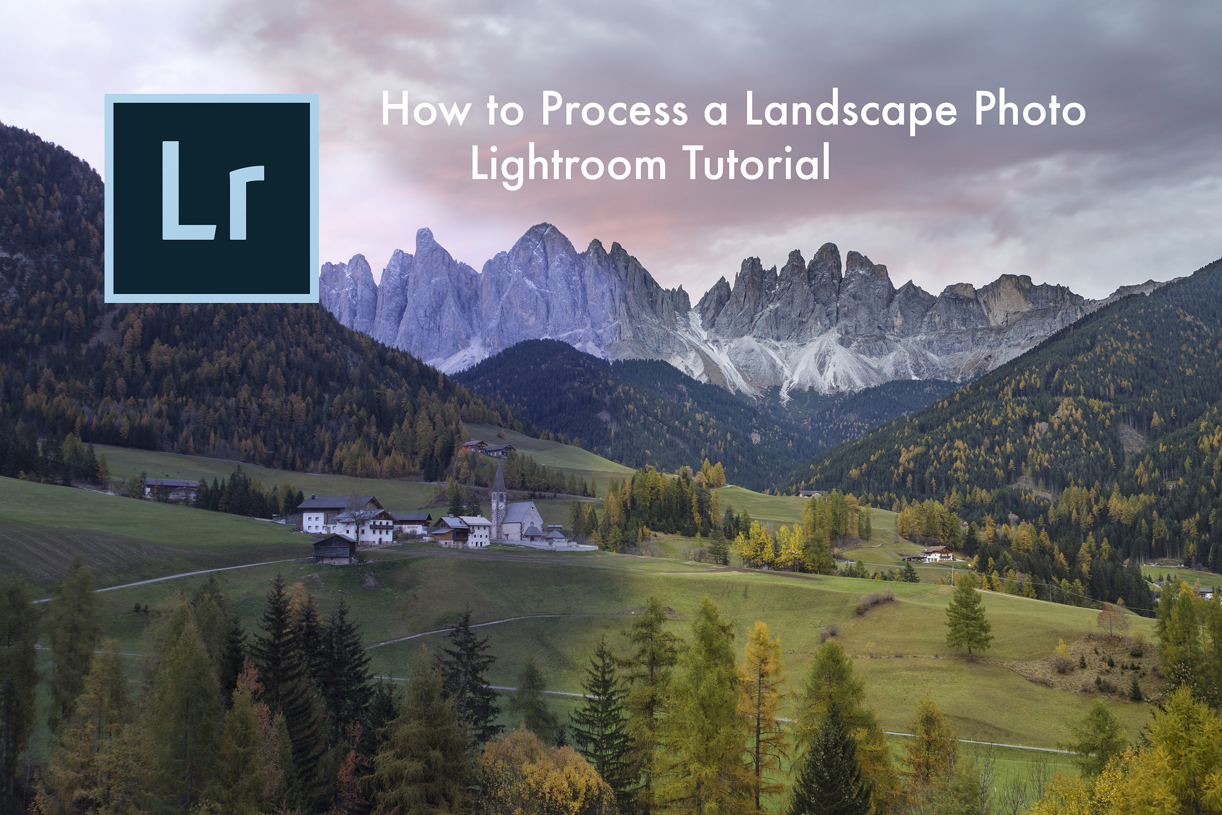

How to Process a Landscape Photo in Lightroom is my latest YouTube video, which explores some of my image processing techniques. Adobe Lightroom has become one of the go-to raw editors for photographers of all levels, from amateurs to professionals. And like its stablemate Adobe Photoshop the actual process of polishing our photos can be done in a number of ways.
Adobe Lightroom has become one of the standard software programs that we turn to in order to process our images. I use it and try to keep the integrity of the image as natural as I can.
As with its sister program Adobe Photoshop, there are a number of different ways in which to process an image, so here I give you a look at how I am currently processing my raw files in Adobe Lightroom.
Before I touch a single slider, I want as much information in the raw file as possible. That gives me room to work, especially with the sky and shadows, without forcing the image into something it never was.
I don’t like taking shortcuts with false skies or heavy blending if I can avoid it. If I expose well in the field, I can spend my time refining the image instead of rescuing it. The final result looks more natural, and it stays closer to what I saw on the day.
My editing also changes over time. That’s normal. I always look at my workflow and ask whether I’m still processing in the best way I can. If something feels heavy-handed or dated, I change it. So this is the way I process a landscape photo in Lightroom at the moment, and it works because it keeps the image clean, believable, and controlled.
The first thing I check is dust. If you change lenses outdoors, you get dust spots. That’s part of photographing in the field, especially when you’re moving quickly between focal lengths.
I start by pressing Q to activate Spot Removal. Then I zoom to 100% so I can see the file properly. Dust spotting at full view is guesswork. At 100%, the marks stand out, and I can clean them with confidence.
Next, I press A to turn on Visualise Spots. That makes hidden sensor dust much easier to see, especially against bright skies or soft tones. Once the overlay is visible, I click on each dust spot and let Lightroom sample a clean area. If I need to move around the frame, I hold the space bar to bring up the hand tool.
This part is boring, but it matters. A strong edit can fall apart fast if a dark spot is hovering in the sky.
Here are the shortcuts I use most at this stage:
Q opens Spot RemovalA toggles Visualise SpotsSpacebar brings up the hand toolI always clean the file before I judge colour, contrast, or sharpness.
Once the dust is gone, I switch Spot Removal off Q and zoom back out. Then I move on to the real edit.
A natural edit starts with a neutral base. If the profile is pushing colour or contrast before I’ve even begun, every adjustment after that becomes harder to judge.
I go straight to the Camera Calibration panel. In my setup, Lightroom was using Process Version 2012 with the Adobe Standard profile. I change the profile to Camera Neutral.
That shift is often visible straight away. In this image, the lower tree line changed the moment I selected it. I use Camera Neutral for one reason: it gives me a flatter, more honest starting point. From there, I can add what the file needs, rather than fight what the profile has already added.
After that, I open Lens Corrections and enable profile corrections. This removes any lens distortion, even if the effect is small. I often toggle it on and off once so I can see what Lightroom is fixing.
I also tick Remove Chromatic Aberration. Fringing can show up along hard edges, especially around tree lines against the sky. In most cases, that one tick does enough, so I don’t need to go into the manual colour controls and start defringing by hand.
Only then do I look at the histogram. I want to see whether the shadows are clipping on the left or the highlights are clipping on the right. In this file, neither end was hard into the corners, which told me I still had useful detail.
If I press J, Lightroom shows clipping warnings. That’s a quick way to check whether any highlights are blown or whether the shadows have gone too far. I like seeing a bit of room on both ends of the histogram because it means I can shape the file without breaking it.
The Basic panel is where the image starts to come together. I don’t rush through it. Most of the heavy lifting happens here.
I had already set white balance in the camera by eye, on location. Even so, once I looked at the file in Lightroom, I could see a colour cast. The histogram also hinted at it, with a strong blue presence in part of the image.
So I grab the Temperature slider and move it to the right to pull some of that blue cast out. Then I look at the Tint slider. There was a touch of magenta too, so I eased Tint back to the left until the colour felt more balanced.
At this stage, I don’t chase numbers. I watch the image and the histogram, and I stop when the scene feels believable again.
If I want to compare the result, I use Y for a before-and-after view. I also use the backslash key, \, because it’s a quick way to toggle between the edited and original file.
Once the colour looks right, I move to tone. I usually start with the Whites slider. If I hold Alt while dragging it, Lightroom shows me where clipping begins. That makes it easy to push the whites until the image has more life, then pull back before I lose detail.
After that, I lift the shadows a little. I don’t want to flatten the image, so the change stays gentle. I only add enough to reveal detail where the file needs it.
Then I raise the overall exposure a touch to brighten the frame. That can be a blunt adjustment, and sometimes I could blend the tones more carefully, but for this image a slight exposure lift gave me the look I wanted.
As soon as I do that, the sky starts to edge towards overexposure. So I tap J again, check the clipping warnings, and move to a local adjustment.
To recover the sky, I add a Graduated Filter and drag it down from the top of the frame. If I press O, Lightroom shows the red mask overlay, which helps me see exactly where the adjustment is landing.
With the grad in place, I lower the exposure in the sky until it sits closer to how I remember it. Then I often fine-tune the global Whites or Exposure again, because those earlier changes and the new sky adjustment affect each other.
The problem with any grad is simple. It doesn’t care where the horizon is. If the grad crosses over hills or trees, it darkens those too. That’s where the brush inside the Graduated Filter becomes useful.
I switch to the brush, choose Erase, and paint the adjustment away from the hill and tree line. I increase or reduce brush size with the square bracket keys, and I can adjust the feather as I go. Auto Mask helps because it tries to detect the edge between the sky and the land. Still, I keep an eye on it. Auto Mask isn’t perfect, and if it removes too much from a mountain edge the result looks false.
This stage takes a bit of care, but it gives me a sky that feels controlled without leaving a dark band across the landscape.
Once the major correction is done, I start adding shape and colour back into the frame. This is where restraint matters most.
I add some clarity, but not much. Clarity can bring texture into grass, trees, and cloud, yet it also strips colour out faster than many people realise. If I push it too far, the green meadow loses its richness and starts to look washed out.
So I keep it around the 20 mark, sometimes a little higher, sometimes lower. I only want enough to give the image some bite.
After that, I use Vibrance instead of Saturation. I don’t like the Saturation slider for most landscape edits because it gets heavy too quickly. Vibrance is gentler. It restores some of the colour that clarity has taken away, and it does so without shouting.
This is the balance I aim for:
| Slider | How I use it | What it does |
|---|---|---|
| Clarity | Small increase, around 20 | Adds texture, but can drain colour |
| Vibrance | Gentle lift | Restores colour more naturally |
If clarity makes your greens look pale, you’ve already gone too far.
I often check the Tone Curve after the Basic panel. I prefer working on the RGB curve because I can target a colour cast if one is still hanging around. In this image, though, I liked the look after the earlier corrections, so I left the curve alone.
That’s worth saying because not every panel needs attention in every edit. Good processing is often about knowing when to stop.
Then I move to HSL. I leave Hue alone for this file because changing hue can make the image drift into strange colour shifts. That’s usually where a natural scene starts looking over-processed.
In Saturation, I use the targeted adjustment tool and work on small areas. I add a touch more colour to the greens in the meadow, a little to the trees, and a slight lift in the sky. The changes are subtle. If I can clearly see the edit, I’ve probably pushed too hard.
In Luminance, I tweak how light or dark those colours appear. I may lift a colour slightly if it feels dull, or darken it a touch if it looks thin and weak. On this image, I also watched the reds closely because they can build too fast. When they started to feel too strong, I pulled them back a little.
I don’t use Split Toning on this frame. It can be useful, but this image didn’t need that extra layer.
At the end, I go to the Effects panel and add a small amount of Dehaze, around 10. It wasn’t a hazy day, but a little Dehaze can add a touch more contrast and structure.
Then I revisit the graduated filter over the sky. Sometimes I add the slightest bit of saturation, a touch of clarity for the clouds, and pull highlights down a little. Used carefully, this gives the sky shape without making it heavy.
By this point, the image looks far better than it did at the start. The dust spots are gone, the colour cast is corrected, the sky holds detail again, and the overall frame feels closer to what I remember seeing in Santa Maddalena in the Dolomites.
That is always my goal. I don’t want the processing to become the subject. I want the photograph to look like the place felt.
A lot of this work starts long before I open Lightroom. Good field technique makes editing simpler, and that is something I teach on my photography tours and workshops.
If you’d like updates on trip reports, workshops, and new announcements, you can also join my newsletter for photography updates. That’s where I share what I’m working on and where I’m heading next.
The best Lightroom workflow is the one that helps you stay honest with the file. For me, that means starting clean, correcting the colour cast, shaping the tones, and keeping every adjustment under control.
When I process a landscape photo in Lightroom, I want the final image to feel natural. If the edit pulls attention to itself, I’ve missed the point.