 Skip to content
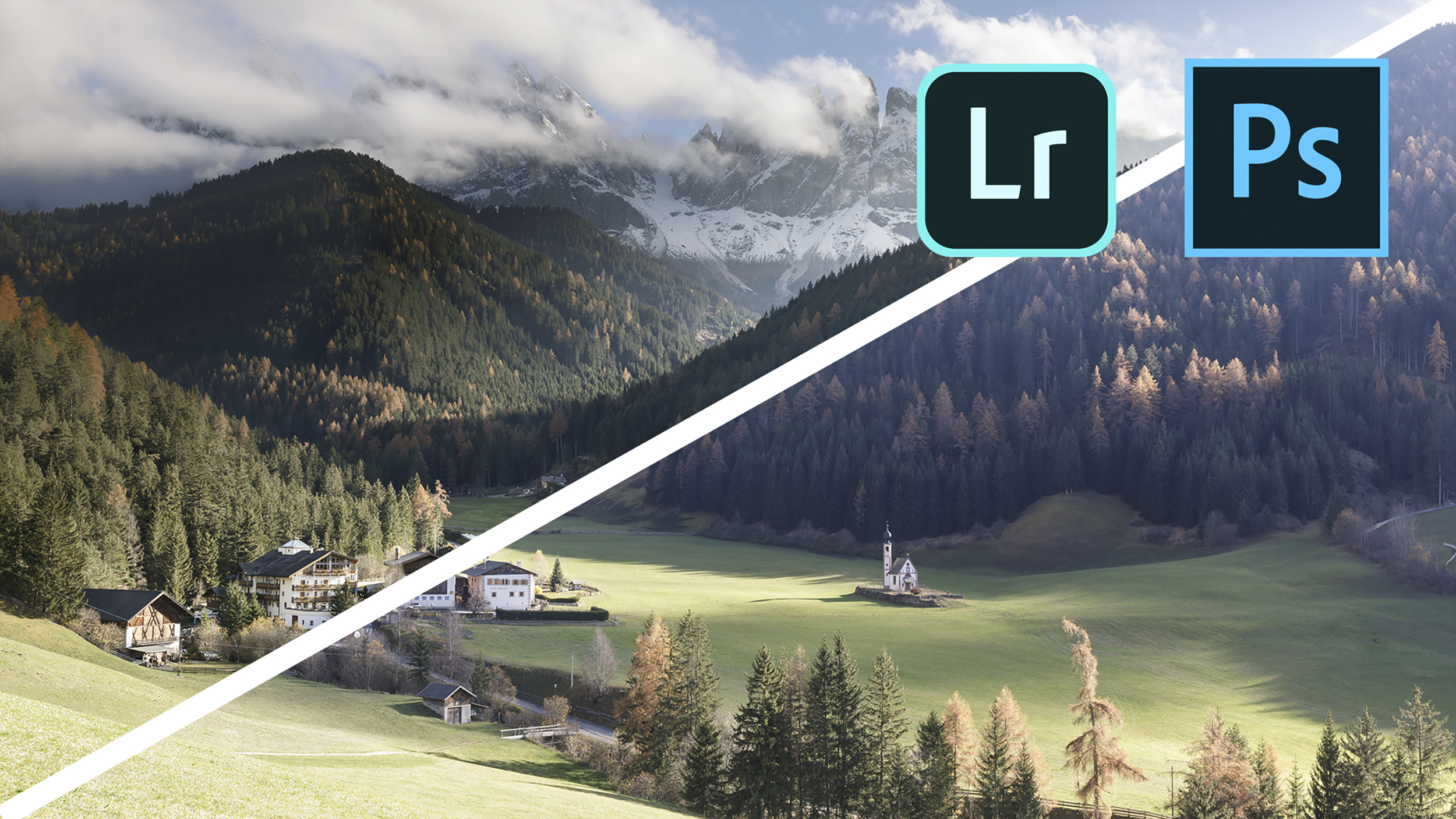

Adobe Lightroom and Adobe Photoshop form the backbone of any landscape or travel photographer’s work. The majority of us use either or both in conjunction with one another.
In my latest YouTube vlog, I wanted to show some of the processing techniques that I do in order to create a finished file. And I say some as there just wasn’t enough time to show everything that you “could” do to an image.
Post-processing is a personal thing. Everyone has their own way of approaching it. And certainly, when it comes to Adobe Photoshop, there are many ways in which to achieve it.
Hopefully, you’ll get an insight into how I edit landscape photos with Adobe Lightroom & Adobe Photoshop. I’m sure that the next vlog on this subject will be different again so keep your eyes peeled and make sure to subscribe if you haven’t done so already!
The image in this edit comes from the Dolomites in early November 2018, photographed in the afternoon at around half past two. It was shot on a Canon 5D Mark IV with a 24-70mm f/2.8 Mark II lens.
I’m working with two bracketed exposures rather than a single frame. The first exposure is for the foreground at ISO 100, f/11, 1/8 sec. The second is the darker exposure at f/11 and 1/60 sec, held back to keep detail in the sky.
That choice matters because the sky in the brighter frame is blown, but the foreground looks good. A graduated filter in the field could have helped, but in this scene, it would have cut across the slopes and the house in a way that looked awkward. Two exposures give you more control later, especially in a steep valley where the horizon line is anything but straight.
The viewpoint is also worth noting. The shot looks across Val di Funes, and the bridge-side position used for the composition is on private land.
If you photograph from this viewpoint yourself, get permission first. The field is private property.
That small detail says a lot about the edit. The image is not built on rescue work. It is built on a clean capture with a clear reason for bracketing.
Lightroom is where you prepare both files, so Photoshop has less to fight with later. The aim is not to finish the image here. The aim is to create two clean, consistent files that blend well.
The first stop is the spot removal tool. Press Q, switch on the mask view with H, and push the visualisation slider to the right. That makes dust spots jump out at you. In this file, none show up, which means you can move on without spending time cloning marks that are not there.
Next, switch the profile to Camera Neutral. That drops some of Adobe’s default colour and contrast treatment, so you begin with a flatter and more honest base. It is a small move, but it helps because you are about to blend two exposures. The less hidden processing you have in the profile, the easier it is to judge tone.
From there, check the histogram. The sky is clipped in the brighter exposure, which is expected. You are not trying to fix that in Lightroom. You are shaping the foreground so it holds up once the darker sky is blended in.
The foreground exposure gets only a few adjustments. They are simple, but each one has a clear job.
Here is the rough shape of that Lightroom pass:
| Adjustment | What you are doing |
|---|---|
| Whites | Lifting them slightly to brighten the foreground |
| Shadows | Opening them a touch without flattening the scene |
| Vibrance | Bringing back weak colour in the trees and grass |
| Clarity | Adding a little mid-tone definition |
Saturation stays alone. That is deliberate. Vibrance helps muted colours without pushing everything too far, and the file still needs more selective work later.
A small graduated filter also helps control the bright grass and pale track near the bridge. The over-bright area reads high in the RGB values, but part of it is simply a pale path rather than clipped detail. Even so, it pulls too much attention. By angling the grad to follow the line of the valley and keeping it away from the house, you can lower exposure and whites enough to calm the foreground without making it muddy.
At this stage, the sky still looks bad. That is fine. Lightroom is only setting the table.
Once the light frame is ready, you synchronise the shared settings across both files. That includes lens profile correction and chromatic aberration removal. This matters because any distortion mismatch between the two images will make blending harder in Photoshop.
The darker exposure then gets its own quick pass. Because it exists to protect the sky, you do not want extra clarity or extra punch in it. Those adjustments can make cloud edges look brittle and unnatural, so they are backed off.
Instead, you nudge exposure and shadows until the sky feels believable. The bright clouds are kept near the top of the tonal range without turning into featureless white patches. The goal is a clean highlight file with no obvious colour cast.
For this edit, both images are exported as TIFFs or DNGs before moving to Photoshop. That keeps the hand-off simple and avoids profile problems between Lightroom and Photoshop on this particular workflow. It is a practical choice, not a rule for every file.
With both files open in Photoshop, you place the dark exposure on top of the light one. You can copy and paste it, or you can drag it across with the Move tool while holding Shift. Either way, you end up with two clearly named layers, Lights and Darks.
This edit also uses the TK panel, which refers to the Tony Kuyper tools for luminosity masks. The panel includes more functions than you need here, but the key ones are enough: mask creation, fast selection control, and curves-based refinement.
Before you blend anything, check alignment. Set the top layer to Difference mode and zoom in to 100%. If the files are aligned, most of the image goes dark. If wind or tripod movement caused a shift between exposures, you will see edges and halos straight away. Once alignment looks good, return the blend mode to Normal.
That quick check saves you from chasing false problems later. If the layers do not line up, every mask you build will look wrong.
This is where Photoshop earns its place. The scene has a bright sky, shadowy slopes, sunlit grass and a house sitting near the transition line. A straight global blend would not respect any of that.
Start by adding a layer mask to the dark exposure. Then select the Gradient tool with G. If the mask is moving in the wrong direction, tap X to swap black and white.
Now draw a soft gradient so the dark sky begins to show through. Holding Shift keeps the line straight, which helps you place the blend with control. You are trying to recover the sky without dragging unwanted darkness down into the hills.
This first mask does most of the heavy lifting. It restores the cloud detail and gives you a cleaner upper half of the frame. Still, because the terrain rises into the sky, the gradient also darkens parts of the slopes and some trees more than you want.
That is the reason the scene was not handled with a physical grad filter in the field. Photoshop lets you shape the blend after the fact, and that matters here.
Once the gradient is in place, the next step is to refine the mask with a luminosity selection. A darker selection, such as Darks 1 or Darks 2, gives you a better grip on the trees and the shaded slopes.
Using the mask tools, you refine the selection with Curves so the trees and hillside values come through more clearly. Then you apply that selection to the layer mask, hide the marching ants with Cmd/Ctrl + H, and paint gently with a soft brush.
Keep opacity and flow low, around 30 per cent each. That makes the paint strokes build slowly, which is exactly what you want. You are not trying to repaint the scene. You are easing some of the lighter exposure back into the hills so the transition feels natural.
This soft brush pass evens out the exposure between the sky blend and the rest of the valley. It also preserves the logic of the light. The right side of the frame remains brighter where the sun was falling, while the shaded areas still look shaded.
That balance is easy to lose if you paint too hard. Low flow keeps the blend believable.
Once the exposure blend looks right, you can move on to the details that make the file feel finished.
Create a stamped visible layer with Cmd/Ctrl + Alt + Shift + E. Then add a Curves adjustment and build a solar curve. It looks extreme, but it is useful because it makes tiny sensor spots stand out in the sky.
In this image, a close inspection shows no dust marks. That means the layer can go. Even so, this check is worth doing before you move on, especially if the file is heading to a client or large print.
Dust is much easier to fix now than after more adjustments pile up on top.
The bigger issue in this image is colour. The shadows in the lower part of the valley carry a clear blue cast. Some blue in shadow is normal, but here it goes too far and cools the whole scene more than it should.
A threshold layer can help you find the darkest point in the image, but the more useful clue comes from the Info panel. Sampling one of the darker shadow areas shows values around 50, 56 and 84. Blue is running well ahead of red and green.
That tells you what the eye already suspects.
To fix it, add a Curves layer and switch to the Blue channel. Use the hand tool to target the shadow area and drag down slightly. Lowering blue adds yellow, which is the opposite colour in this channel relationship. You do not need to neutralise the shadows completely, because shadow areas often do contain some cool tone. You only need to pull them back until the valley stops looking cold and artificial.
This one move changes the feel of the image. The scene keeps its mountain light, but the shadows no longer look heavy and blue.
Global contrast can wreck a careful blend. This file proves why local contrast is often the better choice.
A basic S-curve across the whole image does add snap, but it also brightens areas that are already close to the limit, especially the pale grass and path in the foreground. That is too blunt.
A better option is another luminosity mask, this time aimed at the darker tree areas and shaded parts of the slope. Using a Darks 2 style selection with Curves lets you deepen those tones slightly without touching the bright clouds or the pale grass.
The result is subtle. The trees gain shape and depth, and the slope on the right has more structure where the light falls across it. Because the adjustment is targeted, the image feels richer without tipping into harsh contrast.
The foreground grass still needs one more correction. It is brighter than the rest of the lower frame, and it keeps pulling the eye away from the house and mountains.
To isolate it, you can create a colour-based pick and refine that selection with Curves until the mask clings mostly to the bright grass. Once the selection becomes a mask on a new Curves layer, you can inspect it, paint out the parts you do not want, and then darken the grass with more control.
Changing the layer blend mode to Luminosity is an important finishing touch. It keeps the brightness adjustment from adding extra saturation, so the grass gets darker without turning unnaturally rich.
A final stamped layer can then take a small overall brightness lift and a mild S-curve, again set to Luminosity. At that point, the image holds together. The sky is controlled, the valley has shape, and the foreground no longer shouts.
If you strip this edit back to its core, four ideas carry most of the work:
The version numbers in the edit were older, Lightroom 7.2 and Photoshop 2018, but the method still holds up. The exact software build is less important than the order of decisions.
If you want to photograph places like this yourself, my current photography tours and workshops page is where you can check the available trips, including Dolomites photo tours when they are running.
The strongest part of this workflow is its restraint. You do not try to force Lightroom to solve everything, and you do not throw heavy global adjustments at a file that needs careful local work.
When you edit landscape photos this way, each step has a clear job. You clean the base, blend the exposures, correct the colour cast, and add contrast only where the frame asks for it.
That approach gives you a finished image that still feels like a real place, which is usually the whole point.